Yes. — That’s the short answer to the question in the title. An obvious follow up question would then be: By how much? — That’s where things gets complicated.
There have been quite a few articles in this blog that relied on equations to estimate average global warming. Typically this involves two equations. One estimates atmospheric carbon increases as a function of CO₂-e emissions. The other estimates average global warming as a function of atmospheric carbon increases. To model things like the feedbacks between climate change and social change as in the ongoing Stages of the Anthropocene, Revisited series, and to make other quick and easy estimates I need such equations. The problem, however, is that both of these relations are much too complex to be captured in simple equations, especially when values are outside the ranges we are used to. Thus far, I was under the impression that I had approximations that worked reasonably well – that is, well enough to get an in-the-same-ballpark kind of estimate – but it turns out that I was wrong.
Obviously, this implies that many of my recent articles on climate change at this blog that make use of these equations are wrong as well. I will add disclaimers or other kinds of notes or comments to those articles. I prioritized correcting Carbon-neutrality by 2050 because that article gets up to a 100 visitors per day and its warming predictions turned out to be about 1°C too high (but it’s possible that further corrections turn out to be necessary). In case of the aforementioned models in the Stages of the Anthropocene, Revisited series, things are a bit more complicated, however, due to the feedback from warming to other systems (especially in model 3). Hence, I cannot just update the final results of those models, but rather need to change the model itself and run a series of new simulations at different parameter settings. Due to feedback loops and consequent complexity, it is hard to predict how the results from a future model 4 will differ from model 3. It may still predict 4°C, but it could also turn out to be very different.
As mentioned, there are two steps in the calculation from CO₂-e emissions to average global warming. The first is the calculation of atmospheric carbon increase due to emissions; the second is the calculation of average global warming due to atmospheric carbon increase. The second turns out to be the less problematic part, so let’s start there.
from atmospheric carbon to warming
If the goal is to find some simple function that gives expected average global warming as a result of atmospheric carbon increase, then the obvious first step would be too look at the historical data. The following figure shows average global temperature anomaly in degrees Celsius – red line, right y-axis – and the concentration of carbon in the atmosphere in parts per million (ppm) – black line, left y-axis – from 1880 to 2021.
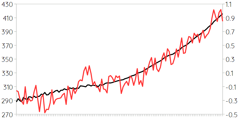 The correlation between these two variables is as high as 0.955, which is perhaps more clearly illustrated if we put the same data in a scatter plot like this:
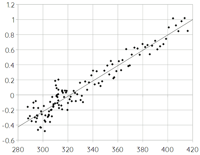 The line in this scatter plot is the trend line. It’s function is:
in which ΔTanom. is the temperature anomaly (i.e. average global warming) and Catm. is atmospheric carbon concentration.
However, this equation returns 2.4°C of average global warming in case of 560 ppm (i.e. a doubling since pre-industrial levels), which cannot be right. The generally accepted measure of “climate sensitivity” – that is, the average level of warming in case of 560 ppm – is 3.1°C.1 This means that the relation is non-linear. We need a function that gets both the historical data right – or as close as possible, at least – and goes through the point of 3.1°C at 560 ppm. Of course, there are infinitely many ways of doing that, but most of those are either implausible or much too complicated, or both. The simplest function that I could come up with that gives the desired result is the following:
(The parenthesis aren’t necessary. I just find they make the equation easier to read.) At higher concentrations of atmospheric CO₂ this equation deviates a lot from the linear function shown above, which can be easily illustrated by extending the scatter plot like this:2
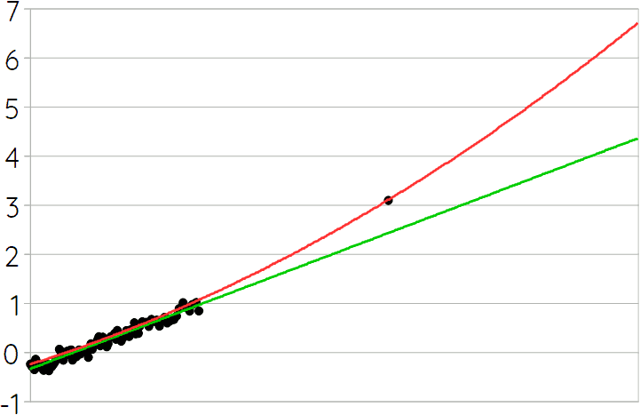 The x-axis in this graph ranges from 288 ppm to 750 ppm. The difference between the two lines/equations at that point is 2.4°C. Notice also that the red line (i.e. the second, quadratic equation [1.2]) doesn’t fit the historical data as well as the green line (i.e. the first, linear equation [1.1]). It isn’t difficult to make the non-linear equation fit better, but unless one opts for rather exotic functions, this would make the difference between the two curves even more extreme at large values. Or in other words, a better fit to the historical data together with the requirement of going through the 560 ppm / 3.1°C point, would lead to very extreme warming predictions at higher concentrations of atmospheric carbon.
There is a further complication, however. Not all data and/or predictions about average global warming or temperature anomalies use the exact same reference point, and it may be the case that – because of that – the historical data I’m using gives lower numbers than what the standard sensitivity measure is based on. If the data is adjusted to such a hypothetical (?!) difference (which might be around 0.2°C), then we get a different equation:
This equation gives slightly higher predictions for lower levels of atmospheric carbon, but (significantly) lower ones for (very) high levels. Its prediction for 750 ppm is 1°C lower than the previous equation [1.2], for example. (And thus 1.4°C higher than the linear equation [1.1].) This equation also seems to produce estimates that are fairly close to those given by more advanced modeling methods – as far as I can see, at least – and for that reason this last function is probably the best simple approximation (at least, for now).
The foregoing explains the fact that the historical data and the climate sensitivity point are not on a straight line by means of non-linearity, but that is not the only possible explanation – it could also be explained by a time lag between emissions and effects. Furthermore, I think that it is typically assumed that the relation between atmospheric carbon and “direct” warming (i.e. before tipping points etc. are taken into account) is (close to?) linear, and consequently, [1.3] may not be a good approximation. A simple linear function would be a line that passes through the point where axes cross (i.e. 0°C/280ppm) and through the 3.1°C at 560ppm point. Hence,
According to this equation, we should be at 1.5°C of average warming right now, but we’re only at 1.1 or 1.2°C, which should have been reached at approximately 385ppm, the atmospheric carbon level of 2008. Hence, if [1.4] is right, then we’re almost 15 years behind, or in other words, there is a 15-year time lag between carbon emissions and their full direct effect. If this is right, that also means that even if we would stop all emissions right now, we’d still reach 1.5°C in the mid 2030s. It would also mean that socio-economic feedbacks would work much slower, which might imply more emissions before cascading collapse would significantly reduce or even end them. This is something a future model might have to take into account.
from emissions to atmospheric carbon
Here things get a bit harder, but this is also where the equation I used before got things very, very wrong. That is, my old equation vastly underestimated natural carbon sequestration. Not all carbon that is emitted ends up in the atmosphere. A lot of it ends up in plants, soils, and water. Most estimates I have seen suggest that around 45% gets into the atmosphere, while the rest is sequestered. However, it is expected that with increasing warming the oceans will be able to take up less carbon (and this may have already decreased by up to 10%) and that terrestrial sequestration will also decline. Ecosystem collapse and land degradation will have especially big (and negative!) impacts on natural sequestration, which means that the percentage of emitted carbon that ends up in the atmosphere is expected to rise. Because that percentage depends both on how much is emitted in a year and (indirectly) on how much has already been emitted it is, thus, effectively impossible to model atmospheric function as a function of just annual emissions. Unless it turns out that complications like these have only minor (or even negligible) effects, of course, but that doesn’t seem very likely.
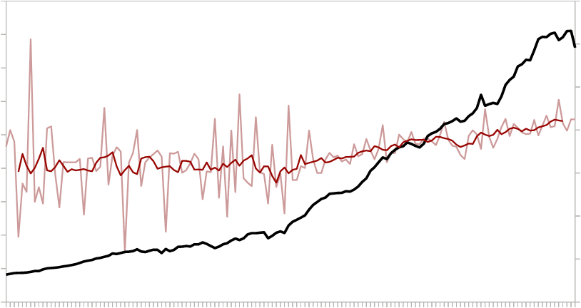
As in case of the relation between atmospheric carbon and warming, available historical data seem to provide a good starting point. The following graph shows the yearly change in atmospheric carbon (black line), the yearly carbon emissions (light red line), and the running seven-year average of the latter (dark red line) between 1880 and 2020. The running average better represents the trend because there is too much “noise” and randomness in the yearly data.
 While there is a correlation between the two variables, the relation isn’t immediately clear. The correlation between yearly change in atmospheric carbon and yearly emissions is only 0.50; in case of the running average it is 0.93. A color-coded scatter plot may help to get a better grasp of what the data might tell us. The colors in the following plot represent time. Dark blue is 1884-1900; the next five colors are 20 years each; orange-red is 2001-2017.
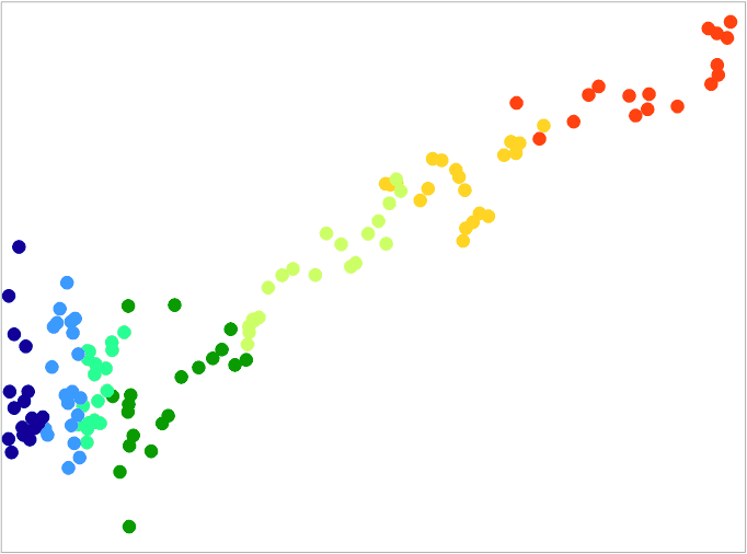 What becomes clear from this graph is that before the Second World War, there is no clear relation between the two variables at all, while after WW2 there is a very clear relation. This may be due to less reliable data in the pre-war period or a host of other factors, but it suggests that we should probably focus on the post-war data. Zooming in on that part of the scatter plot gives the following result:
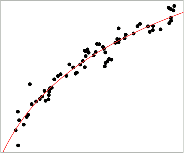 The red line in this last graph is the trend line. It is a logarithmic function with the following equation:
in which ΔCatm. is the yearly change in atmospheric carbon concentration (in ppm), E is carbon emissions and a and b are two positive constants with values that depend on how these carbon emissions are measured. Specifying a and b is fairly useless here, however, as this equation cannot be right as a tool for prediction for two reasons. Firstly, it suggests that only about 35% of emissions end up in the atmosphere and that is surely much too low. Secondly, it suggests that this percentage actually drops with increasing emissions, or in other words, that sequestration increases while we already know that it decreases. In other words, the line in the graph bends the wrong way.
It appears then, that it is impossible to derive a sufficiently realistic model from historical data (alone). There appears to be no other simple equation available either, however, for the reason already mentioned: the relation between emissions and atmospheric carbon increase is too complex and involves too many variables to fit in a single, simple equation. But that conclusion creates a problem for me. I “need” such an equation for the aforementioned climate/society feedback model, but also to be able to make a quick assessment of the plausibility of predictions by others (especially when I find a prediction that strikes me as odd and it comes from a potentially unreliable source).
Perhaps, the best I can do for now is to just assume that natural sequestration takes care of 55% of emissions (and thus that 45% ends up in the atmosphere), and that this percentage doesn’t significantly change in the near future. Possibly, further research can refine this, but until then, this extremely simple equation (in which emissions are measured in giga-tonnes of CO₂-e) will have to do:
concluding remarks
Modeling climate change is incredibly complex so it would be silly to expect that such a core part thereof as the relation between emissions and warming could be captured in two equations. (Especially if they have to be “simple” equations, moreover.) Hence, I should have expected that my simplistic approach didn’t work. I haven’t answered the question “By how much?” yet, however. Or in other words, I haven’t yet mentioned how far off my predictions were, with one exception. It turns out that reaching carbon-neutrality by 2050 (if that would be possible) would lead to approximately 2°C of warming rather than the 3°C I previously predicted. That’s a substantial difference, so I would say that I was way off. On the other hand, for higher concentrations of carbon in the atmosphere, my predictions were (a bit) less far off because my previous simplistic equations were closer to linear than the relation between atmospheric carbon and warming derived here (i.e. equation [1.3]).
In any case, I need to go through some of my old articles about climate change and add some disclaimers, notes, and/or corrections here and there. I will do so in the coming days. After that, as soon as I have time, I’ll start working on a “model 4” of the feedbacks between climate change and sociopolitical effects for the Stages of the Anthropocene, Revisited series. I’ll have to make it possible to easily update that somehow, however, as I hope that some further research will improve the overly simplistic equation [2.2] relating atmospheric carbon to emissions shown above, but that is a less urgent concern.
Postscript (February 12, 2025) — At the time of this postscript, my most recent article about the topic addressed here – that is, how to calculate global warming – is Predicting Global Warming for Dummies. See also Some Further Comments on Climate Sensitivity and Warming Estimates.
If you found this article and/or other articles in this blog useful or valuable, please consider making a small financial contribution to support this blog, 𝐹=𝑚𝑎, and its author. You can find 𝐹=𝑚𝑎’s Patreon page here.
Notes
- Steve Sherwood et al. (2020), “An assessment of Earth’s climate sensitivity using multiple lines of evidence”, Review of Geophysics 58.4: e2019RG000678.
- Because this plot was made in a different way than the previous scatter plot due to software limitations it cannot show different y-values for the same x-values and, therefore, in such cases it only shows the average of those y-values. This explains why there are less outliers in this graph than in the previous graph.