(This is part 7 of the “Stages of the Anthropocene, Revisited” Series (SotA-R).)
Due to a fundamental flaw in models 1, 2, and 3 in this series, the predictions for average global warming in this article are unreliable.
Update (May 21, 2022)
Model 4 fixes this problem and predicts +3.7°C.
There’s no plausible peaceful path to carbon-neutrality. If there’s one key takeaway from my attempts to model carbon (CO₂-equivalent) emissions in stage 1 of the anthropocene, it’s that. Oh, and that’s it will get hot, of course. Unpleasantly hot.
This the fourth in a series of articles on the topic of modeling carbon emissions (and probably the last for now) which is in turn part of a larger series, Stages of the Anthropocene, Revisited, that aims to shed at least a little bit of light on the long term effects of climate change. A series of increasingly complex computer models suggests that we’ll warm up the planet by almost 4°C (or even more) before tipping points and some hard-to-predict feedback effects are taken into account. A conservative guess suggests that those will add (at least) another degree. There are considerable uncertainty margins, of course – more about that below – but these numbers will be the starting point for the next step in this project: sketching what this implies for Earth’s and humanity’s future. That’s a topic for future episodes, however – here I’ll describe the results of “model 3”, discuss some more “exotic” scenarios, and draw some provisional conclusions.
Model 3
Model 3 is based on model 2 (see previous episode), but differs from its predecessor in two key ways. The first, and most important, is that the effects of global warming on drought, heat, cyclones, and extreme weather are no longer assumed to be fixed, but are now part of the model itself. The second has to do with trade.
One of my main objections to standard models of the effects of climate change is that those are based on extremely simplistic models and assumptions about socio-economic circumstances, and that those socio-economic circumstances are assumed to be largely independent and invariant. That is, such models typically take one or more socio-economic scenarios (such as the SSPs) for granted and assume that there is no feedback from climate change to socio-economic circumstances. In as far as social, economic, and political reality changes under the influence of climate change, this is left out of the model. But that is obviously absurd – if a country gets too hot or dry for its current population, then that will have effects, and those effects may in turn affect how much CO₂ is emitted or how much emissions are mitigated or reduced.
It is exactly because of the omission of this key feedback that I started to build my own model(s) of carbon emissions. However, as I observed in the previous episode, the first results thereof (i.e. models 1 and 2) suffered from pretty much the same error. Indeed, the socio-economic response to the changing climate is simulated, but the effects of global warming are assumed to be more or less fixed. And that is nonsense for the same reason – if we emit more, the planet will warm up more; if we reduce emissions faster, heating will also decrease faster; and so forth. So this feedback loop needed to be part of the model. Rather than assuming that there will be drought to the extent x in country y in year z, we need an equation that gives us x depending on how much CO₂ has been emitted up to that point. While it isn’t technically difficult to do this, it adds some further uncertainty. To deal with that, I used the same trick I used before: parameters. The strength of the effect of average global warming on (national) drought, deadly heat, cyclones, and extreme weather depends on a number of parameters that can be set differently. (More about those settings below.)
The second change is a very minor, but not insignificant one. Models 1 and 2 ignored the effects of trade. If country A and B are important trade partners and A suffers from economic crisis or even economic collapse (due to civil war or extreme drought, for example), then that will affect the economy of country B. Modeling this realistically for the long term is nearly impossible, however, as trade relations change. What is fairly constant, however, is that adjacent countries tend to be important trade partners, and economic effects of economic decline in adjacent countries is much easier to take into account. In addition to that, there is also a (small?) effect of the world economy. If the world economy if declining, then this will affect exports, which will affect a country’s economy. Like all other effects, the strength of the influence of adjacent economies and the world economy on a country’s economy can be changed by means of a number of parameters.
Depending on the parameter settings, the model produces very different results, but obviously, not all parameter settings are equally likely – most are absurd. For all parameters, there are credible ranges – they can have lower and higher settings within that range, but moving outside that range is unlikely to produce a credible prediction. However, even this gives an infinite number of combinations of parameter settings. Model 3 has 35 parameters (and a whole bunch of things that can be changed in other ways). If we’d distinguish low, medium, and high settings for all 35, that would result in 335 different scenarios, which is stupendously many. And obviously, it gets even more unmanageable if more than three settings per parameter are distinguished. To reduce the number of scenarios to a workable number, the easiest solution is to group parameters and have low, medium, and high settings for those groups of parameters as a whole. If there are only three groups of parameters, then this results in 33=27 scenarios, and that’s a number I’m comfortable with.
Parameters were grouped according to which parts or aspects of the model they affected. The first group concerns the new addition to model 3, the Climate Impact of Warming (CIW). These parameters determine how quickly drought, heat, cyclones, and extreme weather respond to average global warming, and how severe the effects are. Hence, low CIW means less drought, and high CIW means more drought, and so forth. Medium CIW is based on the drought maps aggregated in Drought and Its Effects in the 2030s and 40s and similar data.
The second group of parameters concerns the effects of drought, heat, cyclones, and extreme weather on civic unrest and economic growth, as well as the interaction between civic unrest and economic growth. Hence, this is the Socio-Economic Impact of climate change (SEI). Low SEI means that drought leads to less civic unrest and less economic damage; high SEI means more. (The medium setting is largely based on historical data.)
Thirdly, there is a group of parameters that have to do with Mitigation/Reduction and Carbon capture (MRC). These parameters determine how quickly and how fast we start reducing emissions, how much we invest in technology to reduce residual emissions, how much carbon capture (DAC) plants we’ll build, and how much reduction efforts and carbon capture are affected by economic crises and (civil) war. High MRC means fast reduction, a lot of carbon capture (perhaps even more than what is plausible), and relative insensitivity of these efforts to circumstances. Low MRC has the opposite effects (and no carbon capture at all). As is the case for the other two groups of parameters, the medium variant sets all parameters to what I consider to be the most plausible values.
Before discussing the results of these scenarios there are a few more details with regards to mitigation/reduction (i.e. MRC) that are worth mentioning. As explained a few episodes ago, the fastest emission reduction schedule that would still be economically/financially sustainable is one that replaces everything as soon as its expected life span is over. Replacing stuff earlier would mean throwing things away before they have fulfilled their expected return on investment and that is only possible if you have some extra money laying around somewhere. Neither governments nor private consumers or companies are likely to have the money needed (especially in circumstances of economic decline and/or other climate-change-related problems), and therefore, faster replacement schedules are unrealistic. For many kinds of “things” there are known average life spans, and thus, their fastest replacement schedules can be easily inferred. Furthermore, we also have data on what kinds of things emit CO₂ and how much of the total they emit. Putting those two kinds of data together results in the yellow line in the following figure.
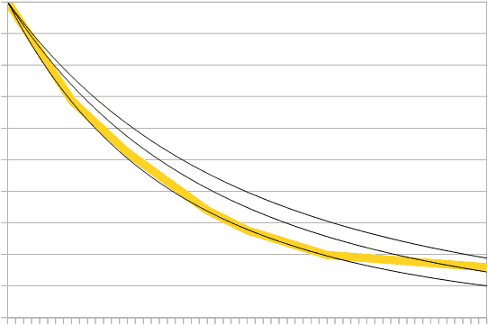 This yellow line represents the reduction of carbon-emitting infrastructure over a 60-year period according to the fastest replacement schedule that is economically/financially feasible. The three thin black lines represent ideal case reduction scenarios in low, medium, and high MRC (from top to bottom). Note, that high MRC reduces a tiny little bit faster than the fastest possible reduction schedule, and that the other two lag a bit behind. I think that medium MRC is more realistic than high MRC because it is likely that the life spans of many carbon-emitting devices will be extended in the future (as they have been in the past) and, therefore, that not everything will be replaced at the earliest (financially) possible date. Electric power plants, for example, have official expected life spans of about 40 years, but in reality they often operate decades longer. And especially in a declining economy (and decline is unavoidable given the reality of climate change), it is highly likely that many things will be used much longer than their originally expected life span. For that reason, even the medium MRC might seem too optimistic.
There is something else that needs to be taken into consideration, however: the black lines in the graph represent ideal case reduction scenarios, but actual reduction efforts depend on circumstances. Poorer countries or countries suffering from economic crisis or civil war, for example, are expected to be much less able to invest in green alternatives, and the model takes that into account. Furthermore, a lack of public pressure on governments and business to make a serious mitigation/reduction effort also leads to less reduction, especially early on. For these reasons, actual reduction can (and will) lag (far) behind the ideal reduction scenarios (except at very implausible parameter settings).
As mentioned, with three groups of parameters and three settings per group, there are 33=27 scenarios. The table below shows the most important results of these 27 scenarios, but the table probably requires a bit of explanation. The three abbreviations have been introduced above, but I’ll explain what they mean again:
- MRC (Mitigation/Reduction and Carbon capture) groups the parameters related to emission reduction efforts, investment in green technology, carbon capture (DAC), and so forth; high MRC means more emission reduction etcetera;
- CIW (Climate Impact of Warming) groups the parameters that determine the influence of average global warming on drought, deadly heat, cyclones, and extreme weather; high CIW means more drought etcetera due to warming;
- SEI (Socio-Economic Impact) groups the parameters that control the effects of drought etcetera on the economy and civic unrest (as well as interactions between those two); high SEI means more socio-economic impact of drought etcetera.
The table cells give three numbers for each of the 27 combinations of low, medium, and high settings for these three groups of parameters. The first number is the approximate year in which carbon-neutrality will be reached (or approached, if the scenario never really gets there). The second number is the part per million (ppm) of CO₂ equivalent in the atmosphere at that point. The third number is how warm it will get due to that amount of CO₂ in the atmosphere according to the standard climate sensitivity metric.1 So, for example, right in the middle of the table you’ll find the results of the scenario “medium CIW, medium SEI, medium MRC”: “2075, 625, 3.8”, meaning that carbon-neutrality will probably be reached around the year 2075, at which point atmospheric CO₂-e will be 625ppm, resulting in approximately 3.8°C of warming (with the usual uncertainty margins and other caveats – more about the latter below). In case of the high MRC column, carbon capture (DAC) is sufficient to actually reduce atmospheric CO₂-e after the years mentioned in the table,2 and therefore, the ppm values and temperatures mentioned for those scenario are temporary maxima rather than “final” results.
| low MRC | medium MRC | high MRC | ||
| low CIW | low SEI medium SEI high SEI |
2120, 830, 6.1 2100, 720, 4.9 2090, 660, 4.2 |
2100, 745, 5.1 2090, 675, 4.4 2080, 630, 3.9 |
2080, 605, 3.6 2070, 585, 3.4 2065, 565, 3.1 |
| medium CIW | low SEI medium SEI high SEI |
2140, 740, 5.1 2110, 660, 4.2 2090, 610, 3.7 |
2090, 680, 4.4 2075, 625, 3.8 2070, 585, 3.4 |
2070, 590, 3.4 2065, 560, 3.1 2055, 545, 3.0 |
| high CIW | low SEI medium SEI high SEI |
2120, 660, 4.2 2100, 600, 3.6 2090, 565, 3.1 |
2080, 620, 3.7 2075, 575, 3.3 2070, 545, 2.9 |
2065, 555, 3.1 2055, 525, 2.7 2050, 500, 2.5 |
The effects of scenarios can be averaged per parameter group setting to get a clearer picture of what the three parameter groups “do”. The average temperature increase of medium MRC is 3.9°C, of medium SEI 3.7°C, and of medium CIW 3.8°C. (The overall median value is 3.7°C – see below.) In all cases low settings result in higher temperatures and high settings in less warming. For all three parameter groups the average of the “low” setting is 4.3°C. The average of high MRC is 3.1°C, of high SEO 3.3°C, and of high CIW 3.2°C. The differences between these values doesn’t mean that one parameter group is more important than another, however, because such differences are also the result of the values I chose as part of the “high” and “low” packages.
What might be most surprising when looking at the table (and at these figures) is that low CIW – that is, less drought etcetera caused by global warming – leads to more emissions and thus more warming. Or in other words, the worse the direct effects of climate change turn out to be, the faster we’ll reduce emissions. The reason for that is simple: more severe drought etcetera leads to mere severe economic decline and more famines, civil wars, and other mayhem, and those are the main causes of emission reduction. Peaceful, voluntary reduction is possible in principle, but unlikely. A high MRC scenario without any civic unrest (medium SEI otherwise, and medium CIW) results in carbon-neutrality by 2070 and 3.3°C of average warming (compared to 2.9°C in the standard, non-zero unrest version of the same scenario),3 but such a scenario assumes that people quietly and passively undergo economic stagnation or decline (and the consequent collapse of capitalism, which cannot survive without economic growth), famine, drought, and “natural” disasters. It basically assumes that people just stoically die without protesting, and without even trying to survive (by fleeing or fighting, for example). That is beyond unlikely. Most non-zero civic unrest scenarios on the other hand – that is, scenarios that assume that people will flee, fight, riot, and so forth – suggest that social and economic collapse plays a bigger role in reducing CO₂ emissions than any concerted effort to reduce them. The fastest and surest path toward carbon-neutrality, then, leads through hell.
Scenarios, Probability Curves, and Predictions
Instead of giving us a single prediction of how warm it’s going to get, the table above gives us 27 predictions, which isn’t really what I need for this series. The point of creating these 27 scenarios, however, is not to consider them in isolation and then maybe pick one or two from them, but to combine them. Obviously, not all parameter settings and scenarios are equally likely. By definition, the “medium” settings are the ones that I consider the most probable – so how much less probable are the “low” and “high” settings? This question is, of course, very hard to answer, but let’s say that these more extreme settings are two-thirds as likely as the “medium” settings. (I actually think they are much more unlikely, but let’s play it safe and go with the two-thirds likelihood.) Then we can calculate the relative probability of each scenario. This probability is (2/3)x in which x is the number of “low” or “high” settings. So, “medium/medium/medium” has relative probability (2/3)0=1; “low/high/medium” has probability (2/3)2=4/9; and so forth.
Next, we need a temperature probability distribution for each scenario. This is basically the curve given by Sherwood and colleagues in their climate sensitivity paper,4 adjusted to different levels of atmospheric CO₂-e (i.e. the ppm values in the table above). The height of the probability distributions of the individual scenarios, then, needs to adjusted such that the surfaces below the curves are proportional to the probabilities of the scenarios. If all of those curves are shown in the same graph, you get the black lines in the following figure:
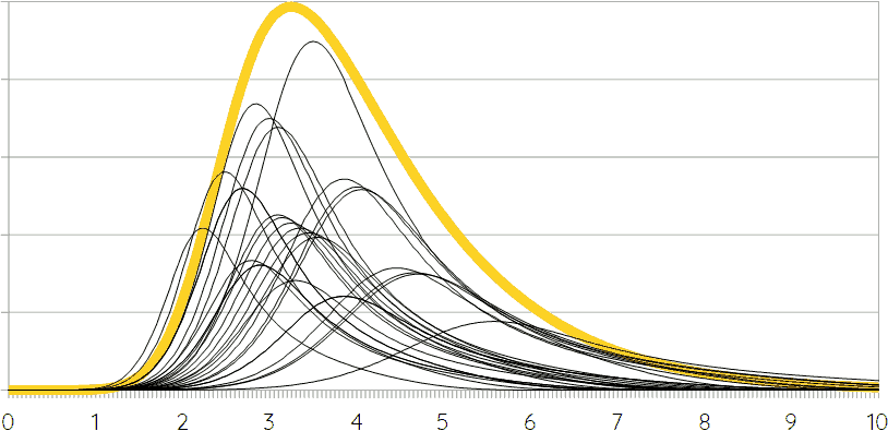 Now, all of these curves simply need to be added together to get the overall probability distribution of the model (that is, the combined probability curve for all scenarios together). This is the yellow line in the figure, except that its height has been adjusted to make it fit in the same graph. Hence, that yellow line represents the best prediction of the model, taking all its variations into account. In numbers, what model 3 predicts is a median value of 3.7°C of average global warming,5 a 67% certainty interval of 2.7 to 5.3°C,6 and a 90% interval of 2.2 to 6.7°C. This is strikingly similar to the results of model 1, which was a very different model.7 That model also predicted a median of 3.7°C and intervals of 2.7~5.0°C and 2.1~6.0°C, respectively.
Throughout this series I have mentioned repeatedly that the passing of certain tipping points (like Amazon die-back) and certain feedbacks that are usually omitted from climate models because they are hard to predict (such as permafrost melting) will add a bit of extra warming on top of what the standard climate sensitivity curve predicts. How much exactly is hard to say, but typical predication are in the tenths of degrees to 1°C or a little bit more range, with (much) lower probabilities for higher numbers. When I presented the results of model 1, I suggested a possible probability distribution for this extra warming due to tipping points and hard-to-predict feedbacks, but I later came to realize that that curve is wrong. It gives a probability of 0 for +0°C, but that is obviously incorrect. For that reason, I had another look at whatever data I could find, and estimated a much more conservative probability distribution for this extra warming. In case of 560ppm (3.1°C) this curve gives a median extra warming of 0.8°C with 67% certainty interval of 0.3~1.5°C. That’s a very wide interval, but uncertainty in this respect is huge. There is, in fact, a lot we don’t know about the possible effects of certain tipping points and feedbacks, which is exactly why those effects aren’t included in the standard climate sensitivity metric and many climate change projections.
In case of model 1, adding the original probability distribution for this hard-to-predict extra warming to the standard climate sensitivity curve resulted in a median average global warming of 4.8°C, a 67% interval of 3.5~6.5°C, and a 90% interval of 2.8~7.7°C. With the new, more conservative estimate these numbers change to 4.5°C, 3.2~6.0°C, and 2.5~7.2°C respectively.
For model 3, using the same probability distribution for extra warming (in addition to standard climate sensitivity) gives the figure shown below. Notice that the y-axis is the same and that the difference in height of the curves is related to their greater width (because the surfaces below the curves stay the same), which reflects the increased uncertainty.
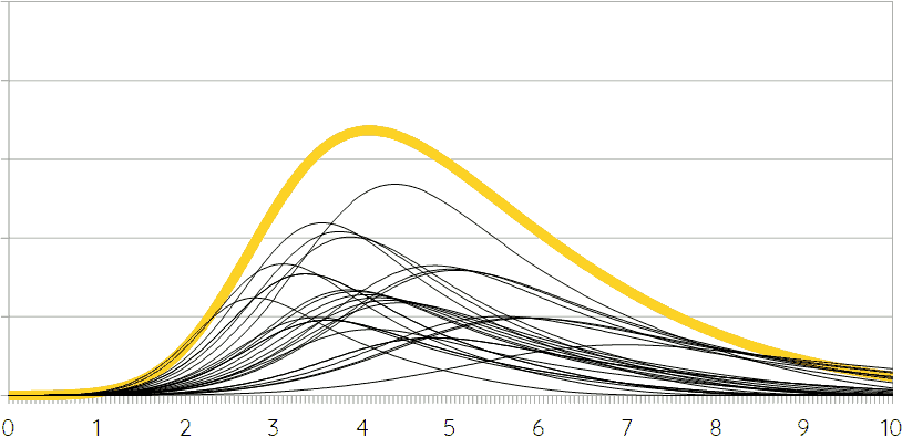 Adding up the curves like before produces the yellow line, which gives us a median average global warming (with tipping points and hard-to-predict feedbacks) of 4.7°C, a 67% certainty interval of 3.2~6.7°C and a 90% interval of 2.4~8.3°C. For ease of comparison, let’s put the results of models 1 and 3 in a table. The “+” symbols in the column headers mark the inclusion of extra warming due to tipping points and hard-to-predict feedbacks.
| model 1 | model 3 | model 1+ | model 3+ | |
| median | 3.7 | 3.7 | 4.5 | 4.7 |
| 67% interval | 2.7~5.0 | 2.7~5.3 | 3.2~6.0 | 3.3~7.2 |
| 90% interval | 2.1~6.0 | 2.2~6.7 | 2.5~7.2 | 2.4~8.3 |
Model 2 isn’t in the table, of course. That model predicted average global warming close to 5°C before tipping points etcetera are taken into consideration. I think that that is overly pessimistic, but more importantly, model 3 is basically an improved version of model 2 (while there is much more difference between models 1 and 2), and therefore, the results of model 3 have effectively invalidated model 2.
The results of models 1 and 3 are very similar, on the other hand, despite the substantial differences in modeling approach. The main difference is that model 3 stretches the uncertainty on the higher end – that is, it considers higher levels of warming more likely than model 1. Both models, however, predict 3.7°C of average global warming with similar uncertainty margins, or 4.5 to 4.7°C if tipping points etcetera are taken into account. A single digit, single number prediction of average global warming based on these models would be 4°C.
More “Exotic” Scenarios
There are, however, a number of more “exotic” scenarios that should be considered, because they might add further uncertainty, or slightly move the median prediction of a combined probability distribution in a particular direction. Examples of such “exotic” scenarios that immediately come to mind include a nuclear war scenario, a scenario without any significant mitigation/reduction, a scenario with a major technological breakthrough that changes everything, and an AMOC shutdown scenario. Perhaps, a scenario with a more serious pandemic should also be added, although I doubt that there would be any significant effects on the long term. Usually more deadly viruses spread less easily, leading to a kind of trade-off between severity and spread. Hence, a virus that both spreads extremely widely and kills very many people is not very likely. Furthermore, even if something like that would happen, its climate-change-related effects could probably compared to those of some of the other disastrous scenarios discussed in the following.
So, let’s start with nuclear war. For obvious reasons, it doesn’t make much sense to talk of the nuclear war scenario as there huge differences in (here relevant) effects between larger and smaller nuclear wars as well as between sooner and later wars. A global nuclear war that starts tomorrow would lead to nuclear winter, kill most of mankind, and terminate pretty much all artificial carbon emissions limiting average global warming to approximately 1.5°C (or maybe a little bit less). Although it is quite possible that nuclear winter (which will last approximately 25 years in this scenario) also tips some elements of the Earth system into a different “setting” resulting in further warming or cooling. The later such a global nuclear war starts, the later carbon emission is terminated and the more warming the result. If we assume that global nuclear war is more likely in the 2030s or 2040s before the world has become to chaotic for any kind of concerted, large-scale war, then it seems that 2°C or 3°C of warming are likely outcomes. How probable such scenarios are is quite debatable, however.
What is, perhaps, much more likely than a global nuclear war is a much more small-scale or regional nuclear war involving something like 15 to 20 nuclear warheads or so. (Rather than 100s.) Between India and Pakistan, perhaps. Or between Israel and its many enemies. Or between Russia and … The list of possibilities is worryingly long. According to research that I have discussed here before, such a “small” nuclear war would put enough soot in the atmosphere to reduce precipitation and growing seasons for anywhere between 5 and 25 years. In some areas, rain could decrease by up to 80%, and the resulting famines and other indirect effects are expected to kill a billion or even two billions of people.8 While such a “small” nuclear war is, perhaps, much more likely than a big one, its relevant effects are much harder to predict. Population reduction and related effects would lead to a very significant drop in emissions, but how much that drop would be would depend very much on which countries are most affected.
In any case, (all/most?) nuclear war scenarios lead to less CO₂ emissions, and thus less warming (mostly by speeding up population decline). Hence, adding such scenarios would lead to a lower overall warming estimate. How much lower is impossible to say as there is really no way to estimate the likelihood of nuclear war (either of the “big” or “small” variety). I don’t think that it is likely that there will be a major nuclear war soon enough to have enough of an impact to matter, however, and if that is right, then the overall impact of these scenarios is pretty much negligible.9
The second kind of “exotic” scenario mentioned is one without any significant mitigation/reduction. This seems to be the path we’re currently on, and even though I think it is unlikely that we’ll stay on this path, it may be worth considering. Contrary to the nuclear scenarios, this kind of scenario can be easily predicted by means of model 3, however. An ultralow MRC setting (similar to the current situation, and with medium settings for SEI and CIW) leads to carbon neutrality some time in the middle of the 22nd century and 4.8°C of warming (before tipping points etc.). A scenario without any mitigation/reduction at all only adds a little bit to that: 5°C of average global warming. That these scenarios also lead to carbon-neutrality despite their lack of planned/intended reduction is for reasons already mentioned above: eventually, social and economic collapse resulting from increasingly extreme effects of climate change wipe out pretty much all carbon-emitting infrastructure (as well as much of humanity). Either we reduce emissions, or they will be reduced for us. There’s no real choice in the matter.
Except, perhaps, if there is some kind of major technological breakthrough that changes everything. There are, of course, as many scenarios in this respect as there are possible breakthroughs, and their effects could be very different. Perhaps, the most relevant technological scenarios have to do with artificial intelligence (AI), energy technology, or geo-engineering.
Some people seem to believe that the development of AI may create an existential threat. I doubt this, for reasons (briefly) explained before, but even if this would be a significant risk, it seems unlikely that AI will develop fast enough to become a real threat before we destroy civilization (through climate change) ourselves. This doesn’t mean that AI is irrelevant, however. In the contrary, recent developments in AI suggests that within the current decade many jobs (inclusing many white collar jobs) will be threatened by AI, which is likely to result in unemployment and financial insecurity for many, which in turn may fuel the already ongoing tendency towards right-wing authoritarianism (or (neo-) fascism), but which almost certainly also lead to growing civic unrest directly. In this way, the development of AI may very well help spread civic unrest and thereby social and economic collapse, thus reducing emissions.10
New energy technologies could have an important impact by making carbon emission reduction cheaper and faster, which would also reduce emissions (but without unrest and/or war as intermediary). Some people seem to pin their hopes on nuclear fusion, but that is a pipe dream. Proponents about nuclear fusion tend to claim that we’re almost at “break-even”, the point at which the system produces more energy than we put into it, but that’s really a lie. It is true that we’re getting closer to Q=1 (“Q” is energy output divided by energy input), but only if you focus on Q of the most central part of the fusion reactor. If you focus on Q of the fusion power plant as a whole, we’re closer to 0.01, and even ITER, the planned state-of-the-art reactor, will probably not exceed Q=0.1. Q is actually very similar to “energy return on energy invested” (EROI), and research has shown that for an energy source to be economically viable it needs to have an EROI approaching 10.11 Right now, nuclear fusion is a factor 1000 too low, and even the best technology available in the near future is a factor 100 too low. Furthermore, progress in the field is excruciatingly slow, and the probability of jumping from Q=0.1 to Q=10 in the near future is nearly 0. And even if we could do it in 20 or 30 years from now (which still seems optimistic), it will take decades more before any significant number of fusion plants could be built and running.
More relevant than fusion are small incremental changes in solar cell (PV) technology and other green renewable energy sources, nuclear energy (other than fusion), and carbon capture. Some of these may make CO₂ reduction cheaper and easier, but the effects are likely to be small. The main effect would be that even in times of crisis, green technology would be affordable, which would reduce emissions in the “3×medium” scenario enough to lower average warming by approximately 0.2°C. Carbon capture (DAC) might have a bigger impact, of course, but the effect thereof is already taken into consideration above. The MRC scenarios basically assume very significant technological developments in carbon capture.
Carbon capture could be thought of as a form of geo-engineering, but there are many other kinds of geo-engineering that are being considered. At present none is likely to (be able to) play a significant role,12 except one, solar radiation management (SRM). I already discusses SRM several times before here – the last time in the previous episode – and won’t repeat what I said before. In summary: SRM is a cheap and easy way to keep global temperatures down and can be carried out by several countries on their own. For that reason, SRM will almost certainly be carried out when things get hot and people get desperate. This is likely to become an effective excuse to slow down carbon emission reductions, and because of that we will end up emitting more. However, because SRM will also have negative effects, which will be unevenly spread (like its positive effects), it is quite possible that it will become a source of (international) hostility, terrorism, and possibly even war. It is, for that reason, also quite likely that it will be terminated suddenly, leading to a quick and disastrous jump in temperature. That jump might put the world over the edge and lead to total social and economic collapse, which would lead to less emissions. Hence, SRM could have positive and negative effects on emissions,13 but I expect the first to outweigh the second, so while the previous “exotic” scenarios might pull towards less emissions and lower temperatures, SRM (which is by far the most probable “exotic” scenario discussed here) is more likely to push towards more emissions and higher temperatures.
Lastly, I mentioned a scenario in which the Atlantic meridional overturning circulation (AMOC) shuts down. At present we don’t know whether this is possible, but the AMOC has been weakening and if it would weaken a lot or shut down completely, this would have very significant impacts, especially (but not only!) in Europe. Some countries (especially in Northern Europe) would become much colder (rather than warmer – Norway might be covered by snow year-round even), and many would become (even) drier. However, the slowing and shutting down of the AMOC would be a very slow process, and while these effects would be very significant on the long term, they would be pretty much insignificant during the next half century or so that determines how much CO₂ we’re going to put into the atmosphere.
Some of the “exotic” scenarios considered here may not really be very “exotic”. In the contrary, I think some kind of SRM scenario is highly likely. It’s very difficult to give reasonable estimates of their exact probabilities and outcomes, however. Most of them seem to pull towards lower emissions and temperatures, but the most likely of all – that is, an SRM scenario – pushes towards more emissions and higher temperatures. For that reason, I think that, all things considered, these “exotic” scenarios suggest that 4°C might be a low estimate. Perhaps, the 4.5°C or 4.7°C of the predictions with tipping points etcetera are more accurate, but again, it is hard to say. What’s most “exotic” about the scenarios discussed here is that we really have no clue how likely most of them are and/or how they would really work out.
Concluding Remarks
For now, this ends the first phase of the SotA-R project. “For now”, because I hope to return to the topic of modeling carbon emissions in stage 1 of the anthropocene at some point, to revise and improve predictions, or better, to replace them with the work of others. This kind of modeling is really not the kind of research someone should do on their own on a cheap laptop computer – it should be done by a team of social scientists and climate scientists with access to serious computing power. But as long as realistic prediction remains taboo in the social sciences14 and climate scientists keep relying on absurdly simplistic socio-economic models and assumptions like the SSPs, I don’t expect much progress in this respect, and thus, for now, I’ll have to do the work myself, on my cheap laptop, and with my rather limited abilities and relevant knowledge. The latter matters, of course, because the obvious implication is that you should take these predictions with a grain of sand. That doesn’t mean that that there other, better predictions available that you should believe instead, because there aren’t, or at least not to my knowledge – thus far, no prediction of carbon emissions and their warming effects takes socio-economic feedbacks into account.
The conclusion of the first phase of the SotA-R project, then, is that we’ll likely to reach carbon-neutrality around 2070 or 2080, and that we’ll warm up the planet approximately 4°C on average.15 The point at which we reach carbon-neutrality is defined as the end point of stage 1 of the anthropocene,16 so the next phase in the project is a sketchy prediction of phase 2, the period between the end of artificial carbon emissions and the (relative!) stabilization of the Earth’s climates and ecosystems in response to those emissions. (The relatively stable phase after that is phase 3.) This will, of course, require some research (and a lot of work), but some of the groundwork has been laid by Mark Lynas’s catalog of climate change effects per degree of heating in Our Final Warning.17 Things get considerably more complicated in the distant future, however, but let’s see whether we can get a somewhat clearer picture of the nearer future first.
If you found this article and/or other articles in this blog useful or valuable, please consider making a small financial contribution to support this blog, 𝐹=𝑚𝑎, and its author. You can find 𝐹=𝑚𝑎’s Patreon page here.
Notes
- S. Sherwood et al. (2020), “An assessment of Earth’s climate sensitivity using multiple lines of evidence”, Review of Geophysics.
- In case of medium MRC carbon capture merely compensates for residual emissions.
- And a scenario without economic decline never reaches carbon-neutrality, even in case of absurdly high levels of carbon capture (DAC).
- Sherwood et al., “An assessment of Earth’s climate sensitivity”.
- But see below.
- This is more often called a “confidence interval”, by the way, but I find that term a bit misleading here. Hence, my preference for “certainty interval”, “uncertainty margin”, and so forth.
- In fact, pretty much all parts of model 1 worked very differently from model 3, even if it is based on the same conceptual model, introduced in the beginning of episode 5 in this series.
- Owen Toon, Alan Robock, & Richard Turco (2008). “Environmental Consequences of Nuclear War”, Physics Today December 2008: 37-42. Adam Liska, Tyler White, Eric Holley, and Robert Oglesby (2017). “Nuclear Weapons in a Changing Climate: Probability, Increasing Risks, and Perception”, Environment 59.4: 22-33.
- On the other hand, I think that a “small” nuclear war is quite likely in the 2030s or 2040s.
- Universal basic income could easily prevent this, by the way, but that’s an entirely different topic.
- Charles Hall & Kent Klitgaard (2018). Energy and the Wealth of Nations: An Introduction to Biophysical Economics, Second Edition (Springer).
- For a well-written review, see: Holly Jean Buck (2019), After Geoengineering: Climate Tragedy, Repair, and Restoration (London: Verso).
- “Positive” here meaning more emissions.
- Especially prediction – or even the mere mention – of collapse.
- I actually think that 5°C is more likely, given the 4.5°C or 4.7°C predictions that take tipping points etcetera into account, and given the (small?) nudge of SRM and other geo-engineering technologies in the direction of higher emissions. But I have been called a pessimist before, and if I am a pessimist indeed, it may be better to compensate for that alledged pessimism and pick the lower number.
- See Stages of the Anthropocene, Revisited.
- Mark Lynas (2020), Our Final Warning: Six Degrees of Climate Emergency (London: 4th Estate).