(This is part 5 of the “Stages of the Anthropocene, Revisited” Series (SotA-R).)
Due to a fundamental flaw in models 1, 2, and 3 in this series, the predictions for average global warming in this article are unreliable.
Update (May 21, 2022)
Model 4 fixes this problem and predicts +3.7°C.
The aim of this series is a better prediction of the long-term prospects for human civilization (in the context of climate change) than the rather sketchy predictions made in Stages of the Anthropocene three years ago. The previous episodes in this series discussed some relavant aspects of climate change, as well as some general ideas about how to make such a “better” prediction. A key point made in the original article is that the anthropocene consists of multiple stages and that the long-term depends on how much carbon is emitted in stage 1 (which ends when artificial carbon emission return to zero). For that reason, the previous episode in this series presented a number of considerations with regards to modeling carbon emissions in stage 1. The present episode discusses a fist attempt to build such a model, based to a large extent on those considerations, as well as what that model shows.
For those who don’t have the time or patience to read the whole article, here’s a very brief summary of the main findings. Without taking tipping points etcetera into account the current model predicts that carbon emitted in stage 1 of the anthropocene will commit us to approximately 3.7°C of average global warming (66.7% certainty interval: 2.7~5°C). If tipping points etcetera are taken into account (but there really is too much guesswork and rough approximation involved for a reliable estimate) this rises to 4.8°C (66.7% certainty interval: 3.5~6.5°C). I’m planning to build another model to test whether that makes similar predictions (or whether these predictions are artifacts of the current modeling approach).
the model
To avoid making this article longer than necessary, I will not repeat all the relevant considerations about modeling carbon emissions from the previous episode, but if the reason for some assumption or aspect of the model described in the following does not become clear in the following you may find an explanation there. The basic model looks like this (except, of course, that the real thing is a spreadsheet rather than a figure and consists of over 370,000 calculations rather than of a few words and arrows):
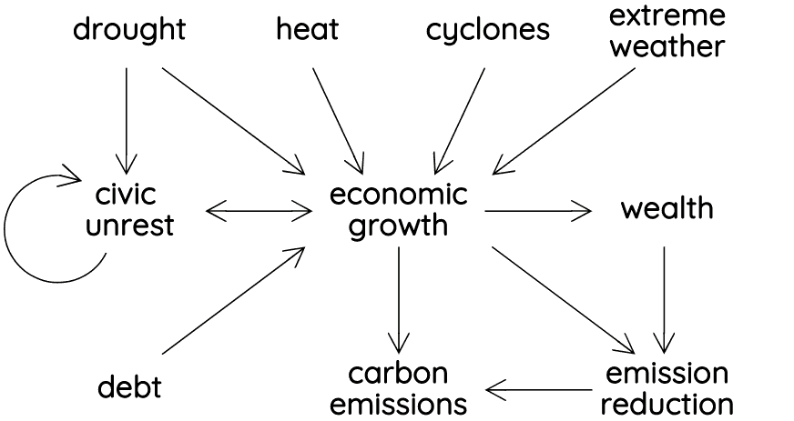 The four variables at the top of the figure represent key effects of climate change. These are independent variables in the model. Of these four, drought is the most important, followed by heat. Cyclones and extreme weather turn out to be quite insignificant on global scales. Some of these variables are based on the maps shown in previous episode. Drought data (for 2030, 2045, and 2065) is based is based on the maps shown in the episode Drought and Its Effects in the 2030s and 40s. Similarly, the data for heat and cyclones is based on the maps in the episode Heat and Cyclones.
The model assumes that all of these affect economic growth, but in different ways and to different extents. The strengths of these effects can be varied by means of parameters. Generally, unless data suggests a clear relation between two variables, any function or relation in the model can be manipulated by changing one or (often) more parameters. The reason for this is that in many cases the nature of such relations (between drought and its economic effects, for example) isn’t really known, and therefore, the model needs to be able to accommodate different (educated) guesses. Of the four climate variables one, namely drought, also affects civic unrest. Water and food shortages are known to increase civic unrest and may even cause civil war. This is an important relation that must be part of the model, but again, because the details of this relation are unknown, the effects can be changed by changing various parameters. Most relations in the model are not linear, by the way. There are many logistic functions, (1+ex)–1, for example, but also other kinds of functions depending on what appears to be the most appropriate kind of function to model some relation.
The circular arrow next to civic unrest represents spill-over effects from one country to its neighbors. In extreme cases, such a “spill-over” may consists of refugees fleeing civil war, but even a minor increase in civic unrest or societal stress in a country is likely to have some effect on its neighbors. The strength of these effects depend on the relative sizes of the two countries involved (big countries have much more influence on small neighbors than the other way around), as well as how close their relations are. (Figuring out these equations for all countries was rather labor-intensive, by the way.) How strong these spill-over effects are depends, again, on a parameter.
Civic unrest and economic growth (or decline) influence each other and this is a good example of the importance of logistic functions in the model. Civic unrest only has a significant effect on economic growth in extreme cases – that is, in case of severe riots or civil war. And similarly economic growth only significantly affects civic unrest in times of crisis – that is, when growth turns into decline.
In addition to climate change and civic unrest, economic growth is also influenced by private debt. As mentioned before (both in the previous episode and in the article Rent, Debt, and Power) if private debt relative to GDP exceeds 150% a financial crisis becomes nearly unavoidable, but the effects of such a crisis are most easily modeled by spreading it out and making economic growth dependent on private debt. (This is another logistic function, and the strength of its effects depend on a number of parameters.)
Economic growth obviously influences wealth, and wealth and economic growth together influence how much a country can spend on the reduction of CO₂ emissions. Another key factor in this respect is time, because the model assumes that as the effects of climate change become more apparent, the pressure on state and companies to invest in emission reduction increases. Similar time factors play a role in various other aspects of the model, by the way. Civic unrest and economic growth start with a base rate determined by relevant data about the current situation, but because the current situation in a country may not be relevant on the long term, these base rates gradually approach the global average, for example.
The most important determinant of changes in carbon emissions is economic growth (or decline). The model separates emissions that could in principle be reduced (because we have the technological capability to do so) from those that cannot be reduced. For a more detailed explanation of the difference, see the previous episode. Increases and decreases work a bit different for the two “kinds” and investment in emission reduction only affects the first kind. However, the model also takes into account that due to technological innovations there is a gradual transfer of “technologically irreducible” emissions (often called “residual emissions”) to emissions that can in principle be reduced.
The model is built in the spreadsheet application that is part of Open Office. The parameters page looks like this:
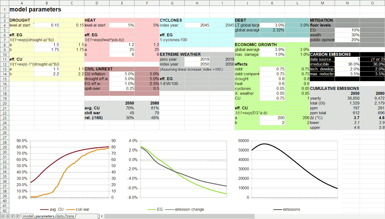 The different colored blocks group parameters related to different parts or aspects of the model. All the white cells in those blocks have values that can be changed – those are the aforementioned “parameters”. This page also immediately shows the main effects of a change in a parameter. The diagrams on the bottom that show civic unrest, economic growth, and emissions are immediately, automatically updated. Perhaps, even more important is the automatic update of the light gray block on the middle right of the screen titled “cumulative emissions”. This shows how much carbon we are expected to emit according to the model with these settings by 2050 and by 2080, how much that would increase atmospheric carbon, and to how much warming that would lead. The image shows that at these settings we’d approach carbon-neutrality by 2090 or so and that this would commit us to close to 5°C of average global warming (which would be devastating), before tipping points and some feedback effects are taken into account.
A small part of the model page itself – that is, the page where all the calculations take place – looks like this:
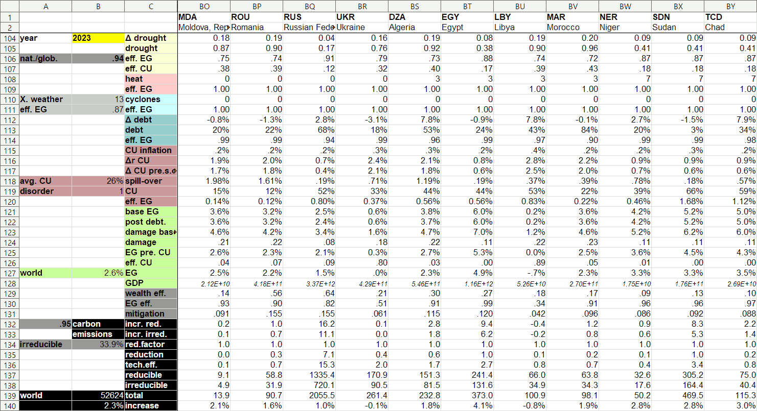 This shows the calculations involved in one year (out of 60) for 11 countries (out of 165). Many of these numbers are rather hard to interpret by themselves and only make sense in the context of the model, by the way (not in the least because this page doesn’t mention units). So, that the effect on economic growth (EG) of Moldova’s private debt in 2023 is “0.99” as this image tells us isn’t very meaningful by itself, for example, but this number plays a key role in further equations that calculate Moldova’s economic growth.
parameter effects
There are infinitely many ways in which all of the parameters could be set, but not all settings are equally plausible, and not all parameters are equally important. As our starting point, let’s use a scenario in which most parameters are set at what appear to be more or less “medium” or moderate values – let’s call this Scenario 1 – and use this scenario to have a closer look at the effects of various specific modules and parameters while considering what would be more or less probable settings. Based thereon, some further scenarios can be constructed and assessed in the next section. Scenario 1 has rising carbon emissions until 2034, after which they start dropping. Net zero is reached somewhere around 2090 (after the modeling period – there is no point extending the model that far in the future because too many circumstances will be very different). By that time we will have emitted an additional 2300 gigatons or more of carbon leading to well over 700ppm CO₂ equivalent in the atmosphere and close to 5°C of average global warming before tipping points and some feedback effects are taken into account. Those would probably add another degree, or perhaps even 2 or 3. What exactly the effects of that much warming would be is a concern for a future episode.
Scenario 1 assumes a moderate influence of drought on civic unrest. Even the kind of crippling drought that leads to crop failure and famine doesn’t produce collapse at this setting. Hence, this setting is probably too low. Still, even at this fairly low setting, the model predicts that by 2050 about 49 countries (of the 165 in the model) have fallen pray to civil war or societal collapse. Most of that collapse occurs in the 2040s, but it continues afterwards – by 2080 about half the world would be embroiled in civil war or have collapsed. This might seem like a lot, but the extent and severity of drought predicted for later this century, together with the fact that humans cannot survive without water to drink and to produce food, suggests that it may very well be worse. A slightly less moderate, but still not extreme – and in my opinion, much more plausible – setting of the effect of drought on civic unrest would result in roughly 108 civil wars by 2050 and societal collapse or something like it in about 84% of countries by 2080. Interestingly, it would also result in reaching net zero around 2080 and to net cumulative emissions leading to 4°C (rather than 5°C) of average global warming.
The other main effect on civic unrest is economic growth. This parameter is also set very low in Scenario 1. Economic crisis leads to a significant increase in civic unrest (with unemployment as an important intermediary), but at such a low setting this is not really taken into account. A more realistic setting leads to more civil war and collapse (66 countries in 2050; 104 in 2080) and to lower cumulative emissions.
There are two further parameters that affect civic unrest. One that determines how quickly people give up, get used to changed circumstances, or just die – on in other words, how quickly civic unrest dies down. And another variable that determines the impact of spill-over from adjacent countries. I think that the first of these parameters has a credible setting in Scenario 1, but it is hard to judge whether that really is the case. Lowering it, obviously, leads to much more civic unrest and collapse. Increasing it has the opposite effect, but that effect is much smaller than lowering it. The fourth parameter, spill-over effect size, is set much too low in Scenario 1, I think. Famines and civil wars will cause significant refugee flows to adjacent countries, for example, and to accurately represent that in the model, this parameter should be set at a (much) higher level. It turns out, however, that more spill-over hastens the spread of collapse, but doesn’t lead to much more civic unrest and collapse. Because of that, the long term effects are relatively small.
Changing all of the civic unrest parameters in Scenario 1 to what seem to be the most plausible settings to me significantly increases collapse and civil war, but it also would result in reaching net zero around 2070 and to net cumulative emissions committing us to about 3.6°C of average global warming (before tipping points etc.). Let’s return to Scenario 1, however, and have a look at economic growth.
As mentioned before, excessive private debts are the main cause of economic crises. Despite all the evidence for this, mainstream (neo-classical) economists tend to ignore the role of private debt, however, because it doesn’t fit well in their models. Of course, according to their models economic crises are impossible, which illustrates nicely that mainstream economics is pretty useless if you want to describe real economies. Still, it is easy to adapt the model to the (false) assumption that private debt doesn’t matter by changing some parameters. The effect thereof would be that net zero would be reached a bit later and that total emissions would lead to approximately +5.5°C. Doing the opposite, setting the effect of debt much higher than in Scenario 1 has the opposite effect, but that effect is much more subtle. The setting of Scenario 1 looks fairly realistic to me, moreover, so there seems to be little reason to change this.
As explained above, there are four climate change effects that influence economic growth. Two of those turn out to be negligible in the model. While cyclones and extreme weather have significant local or regional effects, on the global level, and especially on longer time scales, they do almost nothing. Even at absurdly high setting their effect is quite insignificant. The same cannot be said about drought and heat, however. Slightly raising the effect of one of those decreases warming by a few tenths of degrees. Slightly raising both might shave off 0.5°C of committed warming (mainly by causing more economic and societal collapse).
Economic growth is also influenced by riots, civil war, and/or societal collapse. Hence, at very high levels of civic unrest – that is, when society is starting to fall apart – then the economy also starts falling apart. Available data suggests that civil war typically leads to economic decline of roughly 15%, although short and very intensive conflicts can quadruple that effect. In Scenario 1, the economic effects of civil war are much smaller (almost by a factor 10). The effect of changing this is quite easy to predict: more economic collapse, leading to substantially less carbon emissions. Doubling the effect of civic unrest reduces average global warming to about 4.3°C (before tipping points etc.).
Finally, the model allows for a different setting of long-term yearly global average economic growth. This is set at 3.9% in Scenario 1, because that is the weighted average economic growth I found for the countries in the model. If it is 0% instead, this would reduce average global warming to approximately 4.5°C (from 5°C). I don’t know what a realistic setting would be, but 3.9% might seem rather high. However, it needs to be taken into account that this percentage would be the average if nothing else would change – that is, if there would be no economic crises and no effects of climate change. Small differences in this parameter, moreover, have little effect.
The last set of parameters to be considered here are those related to emissions and emission reduction. There are three parameters that affect emission reduction, called “mitigation” in the model. Two of those are related to the effect of economic circumstances on a country’s ability to reduce emissions. In Scenario 1, even in case of economic crisis, a country can still afford to choose carbon-neutral options in case of 10% of the infrastructure it needs to replace in a given year, and even the poorest countries can still afford to make the same choice in 30% of cases. Naturally, these levels go up automatically as carbon-neutral options start to become cheaper with technological development (and economies of scale), and the model takes that into account. I’m not sure, however, whether the model takes this into account sufficiently and in exactly the right way, but that’s a problem that will need a much closer investigation (and perhaps, a new model) in the future. If these two levels are set much higher – at 80% and 90%, respectively, for example – then emissions drop much faster, of course, limiting cumulative emissions to a level that would assure roughly 4°C of warming (rather than 5°C as in Scenario 1).
The third parameter related to “mitigation” concerns public pressure at the start of the simulation. The model assumes that this will go up automatically with time as the effects of climate change become more apparent to everyone, but the starting situation can be set in different ways. Setting it much higher (which would be very unrealistic as only few people seem to be willing to pressure their governments to make the hard choices necessary) would reduce committed warming by about half a degree.
Three further parameters determine emission reductions in the model. Firstly, there is a percentage of emissions that at the present state of technology cannot be reduced. As explained in the previous episode in this series, that percentage is approximately 36%. This percentage is expected to decrease, however, as new technologies are invented and become available. A second parameter controls the speed of this technological development. It turns out that the first of these two settings doesn’t make a very big difference (unless it is set to obviously absurd values). Even at 0%, average global warming would only be a few tenths of degrees lower. Changing the second parameter doesn’t have much effect either, which isn’t surprising because it controls the long-term effect of what is set by the first.
The third parameter determining emission reductions is much more important. This is the percentage of emission reductions that can be achieved in a country in ideal circumstances. The main thing to take into consideration here is the life cycle and average replacement times of various kinds of infrastructure. As explained in the previous episode in this series, it turns out that roughly 3.5% can be replaced in one year. Of course, it is technically possible to replace more dirty infrastructure with clean alternatives, but that would not be economically feasible, because it would imply throwing away things before they have completed their expected return on investment. Government subsidies might make that possible, but governments will need their money to fix the damage of natural disasters, to deal with refugees, and for various other direct and indirect consequences of climate change. It is, therefore, unlikely that this percentage can be much higher, and small increases have only small effects. Setting it at 5% (which may already be unrealistically high), for example, reduces global warming by only 0.3°C or so.
some scenarios
Let’s, first of all, look at an ultra-optimistic scenario in which climate change doesn’t have any effects either on the economy or on civic unrest, in which private debts are irrelevant, and in which wealth plays no role in a country’s efforts to reduce carbon emissions. While this would be a very peaceful world, it turns out that we’d still be committed to well over 5°C of average global warming. So what would be necessary to change that? Raising public pressure on governments to act now and act drastically (to the maximum) leads to approximately 4.5°C – still not enough. So what if we reduce 10% per year? That would result in carbon-neutrality by 2060 or so, and to 2.8°C of average global warming (before tipping points etc.). This scenario is obviously absurd. It is, however, not that dissimilar from typical reduction scenarios that you’ll find elsewhere – those invariably assume that climate change doesn’t have any significant social and economic effects, that there are no economic crises, that there is continuous economic growth, that we’ll replace dirty infrastructure at break-neck speed, and so forth. None of that applies to the real world, so we can assign a probability to this scenario of 0% – that is, it is impossible.
If we return to Earth from cloud cuckoo land and create a scenario with the most optimistic, but still possible settings, then net zero will be reached around 2070 and we will then have increased atmospheric carbon to approximately 600ppm, which will lead to about 3.6°C of warming. There are various small variations within this kind of optimistic scenario possible, but those only add or subtract one tenth of a degree. (There are, by the way, considerable uncertainty margins in the prediction of average global warming. The model gives two thirds probability of warming between 3.0 and 4.5°C in case of this scenario; 3.6°C is the median value.)
These numbers change significantly, however, if somewhat more pessimistic settings are applied in the civic unrest module. Even if those parameters are set at what I consider to be the most realistic values (rather than really pessimistic values), then we’ll reach net zero around 2060 and will only warm up the planet by some 3°C (before tipping points etc. – I’ll continue emphasizing that). More pessimistic settings lower that by a few tenths of degrees, mostly because this speeds up the process. That “process” is the spread of total collapse. Nearly total economic and societal collapse is by far the most efficient way to reduce carbon emissions. It would also imply widespread famine and (civil) war, and billions (yes, billions) of deaths.
What seems to me the most probable scenario (right now – I might change my mind) is one that slightly increases the effects of drought relative to Scenario 1, and slightly increases spill-over and the economic effects of civic unrest. Other parameters can be set in a number of ways within margins determined by plausibility, but it turns out that the effects thereof are relatively small. The result of this scenario is quite close to those mentioned in the previous paragraph: carbon neutrality by 2055 or so and 2.9°C of warming. By that time civil war or societal collapse would have spread over three quarters of the planet, and the global population would probably be less than half of the current number. While I find this the most probable scenario because of its parameter settings, and while I (still) think that the model is a decent approximation of how the relevant “things” hang together, I have some difficulty believing that this really is a reliable prediction. It seems overly pessimistic in some respects (and optimistic in others).
limitations and alternative approaches
What also feeds this doubt about the model’s outcomes is that the model has some important limitations, and probably there are some things I missed and/or that could be improved as well. There are a number of “things” that are obviously missing in the current model, and that might have to be added for more realistic predictions. One problem is that it is not a probabilistic model. As explained in the previous episode, I should really run thousands of simulations (at least) with different patterns of civic unrest and conflict to take into account that the occurrence and effects thereof are largely probabilistic. Unfortunately, I lack the hardware and skills to do something like that. Of course, I could add some random factor (to civic unrest, natural disasters, and/or to economic growth), and run a small number of simulations to see how much randomness matters, but I’m not sure whether that is really worth the extra effort.
The easiest way to test how much randomness might matter is to take a variant of Scenario 1 with a slightly higher spill-over setting, and to change the civic unrest base rates of some important countries to make civil war in those countries nearly impossible or certain. This variant of Scenario 1 reaches net zero around 2085 and leads to approximately 4.3°C of warming (before tipping points etc.). Setting the civic unrest base rate for selected countries at 0% turns out to have negligible effects; setting it at 100%, on the other hand, making civil war a certainty, leading to a quick economic collapse, does make a difference in case of some countries. In case of Germany, the biggest economy and most populous country in Europe, it has no significant effect and in case of the United States, it merely lowers global warming by a tenth of a degree. For India the effect is a bit bigger: –0.2°C. China is a different story, however. A quick collapse of China (which I consider to be extremely improbable) reduces warming to 3.7°C (i.e. –0.6°C). If there is only one country that could change the outcome so drastically on its own, then this hardly warrants adding all the extra work involved in adding random effects for all of them.
Another obvious omission is demographics. The model does not take the effects of migration (i.e. refugees) and excess mortality (due to droughts, famines, violent conflicts, and disasters) into account. The main reason for this omission is that it would make the model a lot more complicated and that the relevant effects of demographic changes are mostly incorporated in the civic unrest module. How well that part of the model simulates such effects is debatable, however.
A third, and equally obvious limitation is that the model stops at 2080, but even that is a stretch. There are some credible predictions about the main effects of climate change in the next few decades at the geographical scale necessary for this model, but nothing for the second half of the period modeled (i.e. 2050~2080). Furthermore, whoever lives then, will live in a very different world than the one we are used to, and how exactly the world will change is impossible to predict. Hence, the further in the future, the less credible the model – the more it approaches mere guesswork. I extended it until 2080 because otherwise the model couldn’t produce estimates of cumulative carbon emissions at all, but again, that’s already a stretch and extending it even further can only produce nonsense.
In addition to the aforementioned omissions, there are also aspects of the model that could be approached in different – possibly better – ways. One thing I would like to change is how the model deals with the effects of climate change on civic unrest and economic growth. I’m not sure how realistic the current approach is, and I have an idea for a very different approach. Trying that and see how much of a difference it makes – if it makes a difference at all – is probably worthwhile.
Perhaps, even more important is the way the model handles emission reduction. While I don’t think that the way it does so now is necessarily a problem, it might be worth the effort to see whether a “stock”-based approach leads to significantly different results. What I have in mind is to model the “stocks” of clean and dirty infrastructure (including idle, but still usable infrastructure, perhaps) and the changes therein under the influence of economic growth and reduction/mitigation. That is a very different approach than the current one, and it may actually be a more realistic one. It is also considerably more complicated, however.
In any case, these two kinds of changes (effects of climate change and reduction/mitigation) together imply a rebuilding of the whole model from scratch. I’ll probably do that when I have time, but that may not be very soon. The main reason to do that – as mentioned – is to see whether such a different approach leads to very different results. If it doesn’t, then that further supports the current findings; if it does, then I need to figure what exactly explains the difference and which approach is better (i.e. more realistic).
combining scenarios
Despite the aforementioned limitations, the present model probably gives a much better estimate of CO₂ (and equivalent) emissions in stage 1 of the anthropocene than the approach in Stages of the Anthropocene (2018). However, we don’t have that estimate yet. Above, a number of scenarios was discussed and these scenarios have different outcomes. By assigning probabilities to the various scenarios (and estimating probability distribution functions of the individual scenarios) it becomes possible to combine them into one single estimate (with a very broad probability range).
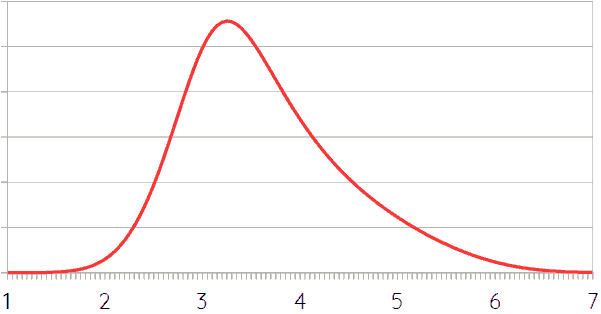
The various scenarios (including variants of Scenario 1) are spread out relatively evenly with regards to outcome. There aren’t significantly more scenarios that predict warming around 5°C than there are around 4°C or 3°C. This is probably caused by the selection of scenarios, however, and most likely there are more ways of ending up with intermediate results than with the extremes. What probably matters more for the overall probability curve is the likelihood of the various scenarios. Above, the scenarios that were suggested to be most probable led to heating around 3°C or – slightly less probable – 3.6°C. There was more variety in the estimated likelihood of other scenarios, but on average there is a decreasing trend. There really isn’t enough data and probabilities are just guesses, but based on the foregoing, it would seem that the probability curve of scenario outcomes looks something like this:
 This curve can then be multiplied by the probability distributions of the individual scenarios, which can be based on the probability curve for climate sensitivity, slightly stretched and flattened to take the uncertainty margins in the calculation from emissions (in Gt) to atmospheric carbon content (in ppm) into account. Such multiplication of curves is done by calculating probability distributions for every extent of warming, multiplying the values with the value found by means of the probability distribution function for scenarios (i.e. the curve above), and then adding everything up. The easiest way to approximate that is just to do this for a finite, but large enough number of values. For example, the figure below shows the weighted probability distribution of every degree of warming between 2°C and 8°C with half degree steps. The thick gray line is the sum thereof (divided by two to make it of similar heights as the other curves). It is slightly bumpy because of the relatively small number of curves added up. The different heights of the curves for various levels of warming represent the different probabilities of scenarios resulting in that level of warming according to the probability distribution shown in the previous figure.
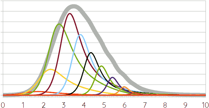 The thick gray line, then, represents an approximation of the probability distribution of global warming due to carbon emissions in stage 1 of the anthropocene according to the current model. It predicts a median value of 3.7°C, a 66.7% certainty interval of 2.7~5°C, and a 90% certainty interval of 2.1~6°C. Those, obviously, are enormous margins. The probability of staying below 1.5°C as advocated by the IPCC is 0%; that of staying below 2°C is approximately 4%. It must be noted, however, that the probability curve in the previous graph is really a rough guess based on insufficient data, and – more importantly, perhaps – that this doesn’t take tipping points and some feedback effects into account. Those are likely to add 1 or more degrees, especially at very high levels of warming.
It is, of course, possible to add the effects of tipping points etcetera, but this adds a lot of further uncertainty. In case of 3 or 4°C of warming, it is quite likely that due to the passing of various tipping points and some hard to quantify and predict feedback effects another degree will be added – I have already mentioned that several times before. There is a small chance that tipping points etcetera add 2°C or even more, leading to a probability distribution that looks something like this:
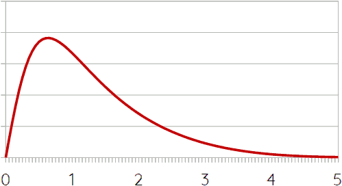 The problem is that there actually is very little certainty about this. We don’t really know when which tipping points will be passed, and neither do we know enough about what their effects will be. And because different tipping points will be passed at different levels of heating, this graph only applies to the case of 3 or 4°C of average global warming. The curve looks (slightly?) different at other levels. If we assume that the main difference will be that at lower levels of warming the curve will be horizontally compressed (i.e. less tipping points will be passed and there will be less extra feedback effects, leading to less extra warming) and that at higher levels if will stretched (with the opposite effect), then it becomes possible to “multiply” the resulting curves with the climate sensitivity curve.
The following figure shows two lines. In blue, the probability distribution for the average global warming resulting from an additional emission of 1125Gt CO₂ equivalent, leading to 560ppm. This is basically the same curve as Sherwood and colleagues’ climate sensitivity curve discussed in this blog before, with the addition of a little bit of extra uncertainty related to the translation from gigatons of emitted carbon to parts per million (ppm) in the atmosphere. The red line “multiplies” that curve with a collection of additional-heating-due-to-tipping-points/feedback curves like the one shown above.
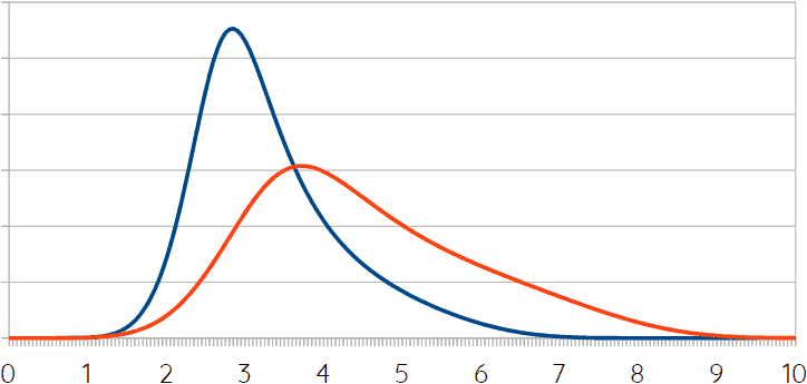 While the (standard) climate sensitivity measure predicts 3.1°C of warming in case of a doubling of atmospheric CO₂e relative to the pre-industrial level (with 66.7% certainty interval 2.6~3.9°C). This attempt to incorporate tipping points and hard-to-predict feedback effects suggests that it might actually be 4.2°C (with 66.7% certainty interval 3.1~6°C). It should be noted that the red curve is much flatter than the blue one, meaning that there is much more uncertainty, or in other words, that the range of likely outcomes is much larger than in case of the red line.
The colorful figure showing very many curves above (i.e. the multiplication of scenario probability with climate sensitivity) can be recreated with this new curve (i.e the red line). Because this new version looks very similar, it is a bit pointless to show the figure itself – the associated statistics are more important. As mentioned, without taking tipping points etcetera into account the current model predicts a median value of 3.7°C of average global warming, a 66.7% certainty interval of 2.7~5°C, and a 90% certainty interval of 2.1~6°C. With tipping points etcetera these numbers rise to a median of 4.8°C, a 66.7% interval of 3.5~6.5°C, and a 90% interval of 2.8~7.7°C. However, I must emphasize again that there is much uncertainty with regards to tipping points etcetera, so I’m actually not sure whether these numbers are really much more meaningful than guessing.
closing thoughts
This first attempt to model and predict carbon emissions in stage 1 of the anthropocene is characterized by huge uncertainty margins and doubts, both about some of the outcomes and about how some parts of the model work. There is, therefore, good reason to try and improve on this model. However, it is not very likely that this will significantly shrink uncertainty. What is modeled here is not a physical system (as in climate science, for example), but the interaction of several social, economic, and political systems, and predicting human behavior – especially on longer time scales – is deviously complicated. The main reason why I want to build another model, then, is to see whether the results presented here hold up. Perhaps they do – in that case we have a better reason to believe that the future really is as bleak as the foregoing suggests. Perhaps they don’t – in that case I need to figure out which model is more credible and why.
When I started this series, I was hoping for a reasonably clear answer to the question how much we are going to heat up the planet, because the series’ aim is to predict what happens after that, in stages 2 and 3 of the anthropocene. Perhaps, it was silly of me to hope for something like that. In all likelihood the uncertainty range is vast, making it necessary to distinguish and predict several (roughly equally likely) trajectories in stages 2 and 3. We’ll see. But first we need another (and better?) model for stage 1.
If you found this article and/or other articles in this blog useful or valuable, please consider making a small financial contribution to support this blog, 𝐹=𝑚𝑎, and its author. You can find 𝐹=𝑚𝑎’s Patreon page here.